Dar Fatima
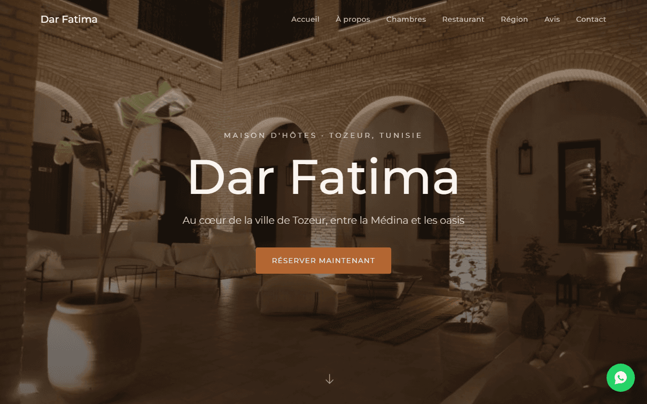
Immersive landing page for a guesthouse in Tozeur, Tunisia. Set between the Medina and the oases, the site captures the warmth of Djeridian hospitality with rich photography and a direct booking flow.
Overview
Dar Fatima is a heritage guesthouse in the heart of Tozeur, Tunisia, and its website needed to translate the experience of Saharan hospitality into a digital journey. The design uses warm earth tones, full-bleed photography of the traditional courtyard, and smooth scrolling to evoke the calm of a riad. Sections cover rooms, the restaurant, the surrounding region, and guest reviews — all driving toward a direct reservation CTA.
Key Features
- Immersive Photography: Full-bleed imagery showcasing the traditional courtyard and rooms.
- French Language: Targeted at the Francophone travel market.
- Direct Booking CTA: Clear reservation flow without third-party platform friction.
- Region Showcase: Dedicated section on Tozeur's Medina, oases, and Sahara.
How it was built
The problem
An independent guesthouse does not lose money because nobody can find it. It loses money because the people who find it arrive through an intermediary that owns the relationship. A booking made through a large travel platform arrives with a commission attached, with the guest's email address withheld, and with the property flattened into the same template as every other listing in the region — the same tiled photo grid, the same amenity checkboxes, the same star average. For a chain hotel that trade is survivable, because a chain sells consistency and the template describes consistency accurately. For a heritage house in Tozeur it inverts the product. What Dar Fatima actually sells is a particular courtyard at a particular hour, the quiet between the Medina and the oases, and a family that has been receiving guests in that building for a long time. None of that survives a comparison grid.
So the brief was not to build a website for a guesthouse. It was to build the one place on the internet where this house is described on its own terms, and to make booking directly from it easier than booking through the platform. That framing decides everything downstream, because it gives the site two jobs that pull against each other. It has to be immersive enough to transmit a feeling, which pushes toward large photography. And it has to convert a traveller who is very likely on a phone, possibly on a slow connection, possibly standing in an airport, which pushes hard in the opposite direction.
Approach & architecture
The build is organised around resolving that tension rather than splitting the difference. The photography is the product, so it is not treated as decoration to be lazily loaded somewhere below the fold. It is treated as the payload, and everything else on the page is budgeted around it.
That starts with accepting that one image is not like the others. The hero shot of the courtyard is the Largest Contentful Paint element, it is the first thing that has to communicate, and it is the only image on the page allowed to block anything. It is served eagerly at a size derived from the actual viewport rather than as a single desktop-width file scaled down on a phone. Every other photograph is deferred until it approaches the viewport, so a guest scrolling toward the rooms section pays for the rooms section and not for the restaurant section they may never reach.
The second decision is that layout stability is a conversion concern rather than a cosmetic one. A full-bleed image that arrives after the text has painted shoves the page around, and on a phone that reliably means someone taps the wrong thing. Every image slot reserves its aspect ratio before the file arrives, so the page assembles into a shape that was already correct instead of settling into one.
The third is that the site is a static artifact. There is no inventory to query, no per-user state, nothing that has to be computed at request time. The entire page can therefore be rendered ahead of time and served from an edge location near the reader, which is the largest single latency win available for an audience that is mostly not in the same country as the origin server. A guesthouse landing page that talks to a database on every request pays a standing cost for a capability it never uses.
Finally, the page is French first, not French eventually. The Francophone market is the primary audience for Tozeur, so French is the language the copy is written in and the language the layout is measured against — rather than English copy passed through translation and then squeezed into boxes sized for shorter words.
Engineering challenges
The hero image is both the product and the performance budget
A guesthouse page lives or dies on its first photograph, which puts the most important asset directly on the critical path. The usual advice — compress harder — degrades exactly the thing being sold, because banding in a sky or mush in a textured wall reads as a cheap property rather than a cheap image. The resolution is to stop treating it as one file. The courtyard shot is encoded in modern formats with a fallback for older clients and generated at several widths, so a phone downloads a phone-sized image instead of a desktop one it will immediately scale down. The saving comes from not sending pixels nobody can see, which costs nothing visually, rather than from discarding quality in the pixels that are visible.
Trust has to be rebuilt from scratch off-platform
A large booking platform supplies trust as infrastructure: a review corpus the property cannot edit, a payment intermediary, and a cancellation policy the traveller already understands. A direct site starts with none of that, and a traveller about to send money to a guesthouse they have never heard of feels the absence sharply. The page addresses it structurally rather than with reassurance copy — concrete specifics a fabricated listing would not bother with, named detail about the surrounding Medina and oases, real photography of the actual rooms rather than stock interiors, and guest impressions presented as part of the page rather than as a badge. Specificity is the trust signal, because generic is what a scam looks like.
French as the design language, not a translation layer
French runs materially longer than English for the same meaning, and hospitality French in particular resists compression — the register that makes a guesthouse sound welcoming is not a terse one. Designing in English and translating afterwards produces headings that wrap to three lines on a phone and buttons whose labels no longer fit. Writing in French from the start means the type scale, the line lengths and the tap targets were all chosen against the text that actually ships. It also lets the copy use the vocabulary the audience expects rather than the nearest English equivalent, which matters more for a product selling atmosphere than for one selling a feature list.
Converting booking intent without owning a booking engine
A real availability calendar means inventory, holds, payment handling, cancellation rules and a support burden — an operational commitment a small guesthouse may not want and may not need. The alternative failure mode is worse: a vague contact form that loses the guest at the moment of highest intent. The page treats the reservation step as a handoff that must not drop anything. A single unambiguous call to action stays present as the guest moves through the page, so intent is never more than one tap from being acted on, and the direct channel is the path of least resistance rather than a fallback offered after the platform links.
Stack decisions
- RenderingStatically generated pages served from the edge
- Nothing on the page depends on the individual reader or on live inventory, so there is no reason to compute it per request. Pre-rendering turns every visit into a file read from a location physically near the traveller, which is the biggest single latency improvement available for an audience spread across Europe and North Africa.
- ImageryResponsive sources in modern formats, with reserved aspect ratios
- Photography is the product, so the saving has to come from not shipping pixels the device cannot display rather than from lowering quality. Declaring each image's aspect ratio up front keeps the layout from shifting as photographs arrive, which on a phone is the difference between a tap landing on the reservation button and landing on something else.
- Loading strategyEager hero, deferred everything else
- Exactly one image has to arrive immediately, because it is the one doing the persuading. Treating the rest as deferred means a guest who reads only the first screen never pays for the restaurant and region sections, while a guest who reads the whole page pays for each section as they reach it.
- Content languageFrench-first copy and layout
- The Francophone traveller is the primary market for Tozeur, so French is the source language rather than a translation target. Sizing the type and the components against real French copy avoids the wrapping and overflow problems that appear when an English-designed layout meets longer text.